How To Create An Elegant App Design
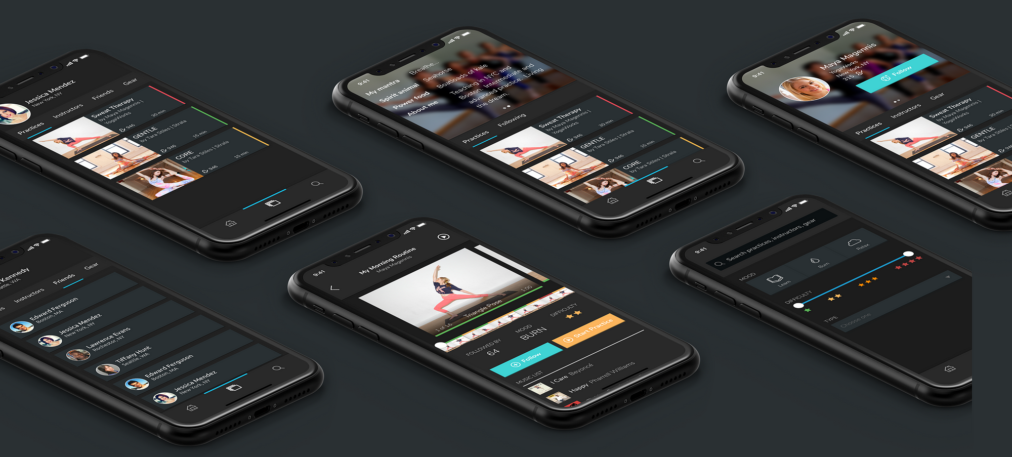
7 Rules for Creating Gorgeous UI
![]()
A non-artsy guide to creating beautiful apps and sites
NOTE: For the full, updated version of this article, please go here .
Introduction
OK, first things first. This guide is not for everyone. Who is this guide for?
- Developers who want to be able to design their own good-looking UI in a pinch.
- UX designers who want their portfolio to look better than a Pentagon PowerPoint. Or UX designers who know they can sell an awesome UX better in a pretty UI package.
If you went to art school or consider yourself a UI designer already, you will likely find this guide some combination of a.) boring, b.) wrong, and c.) irritating. That's fine. All your criticisms are right. Close the tab, move along.
First, I was a UX designer with n o UI skills. I love designing UX, but I wasn't doing it for long before I realized there were a bunch of good reasons to learn how to make an interface look nice:
- My portfolio looked like crap, reflecting poorly on my work and thought process
- My UX consulting clients would rather buy someone's skills if their expertise extended to more than just sketching boxes and arrows
- Did I want to work for an early-stage startup at some point? Best to be a sweeper
I had my excuses. I don't know crap about aesthetics. I majored in engineering – it's almost a badge of pride to build something that looks awful.
In the end, I learned the aesthetics of apps the same way I've learned any creative endeavor: cold, hard analysis. And shameless copying of what works. I've worked 10 hours on a UI project and billed for 1. The other 9 were the wild flailing of learning. Desperately searching Google and Pinterest and Dribbble for something to copy from.
These "rules" are the lessons from those hours.
This article is not theory. This article is pure application. You won't see anything about golden ratios. I don't even mention color theory. Only what I've learned from being bad and then deliberately practicing.
The Rules:
- Light comes from the sky
- Black and white first
- Double your whitespace
- Learn the methods of overlaying text on images
- Make text pop — and un-pop
- Only use good fonts
- Steal like an artist
Let's get to it.
Rule 1: Light Comes From the Sky
Shadows are invaluable cues in telling the human brain what user interface elements we're looking at.
This is perhaps the most important non-obvious thing to learn about UI design: light comes from the sky. Light comes from the sky so frequently and consistently that for it to come from below actually looks freaky.
When light comes from the sky, it illuminates the tops of things and casts shadows below them. The tops of stuff are lighter, the bottoms are darker.
Well, the same is true for UI. Just as we have little shadows on all the undersides of all our facial features, there are shadows on the undersides of tons of UI elements. Our screens are flat, but we've invested a great amount of art into making so many elements on them appear be 3-D .
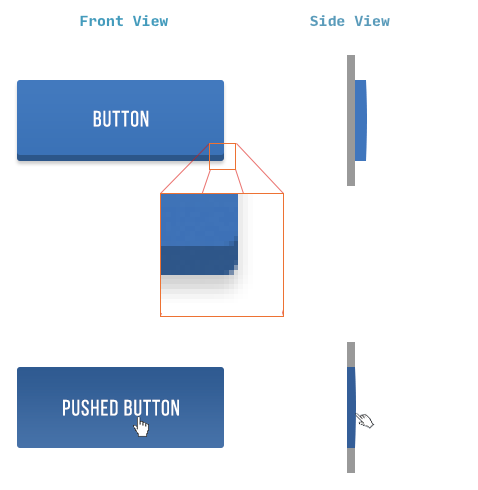
Take buttons. Even with this relatively "flat" button, there are still a handful of light-related details:
- The unpushed button (top) has a darkened bottom edge. Sun don't shine there, son.
- The unpushed button is slightly brighter at the top than at the bottom. This is because it imitates a slightly curved surface. Just as how you'd need to tilt a mirror held in front of you up to see the sun in it, surfaces that are tilted up reflect a biiiiit more of the sun's light towards you.
- The unpushed button casts a subtle shadow – perhaps easier to see in the magnified section.
That was just a button, and yet there are these 4 little light effects present. That's the lesson here. Now we just apply it to everything.
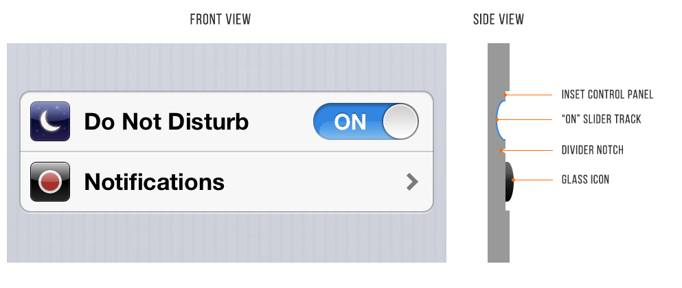
Here is a pair of old iOS 6 settings — "Do Not Disturb" and "Notifications". Look how many light effects are going on with them.
- The top lip of the inset control panel casts a small shadow
- The "ON" slider track is also immediately set in a bit
- The "ON" slider track is concave and the bottom reflects more light
- The icons are set out a bit. See the bright border around the top of them? This represents a surface perpendicular to the light source, hence receiving a lot of light, hence bouncing a lot of light into your eyes.
- The divider notch is shadowed where angled away from the sun and vice versa
Now that you know, you'll notice it everywhere. You're welcome, kid.
Rule 2: Black and White First
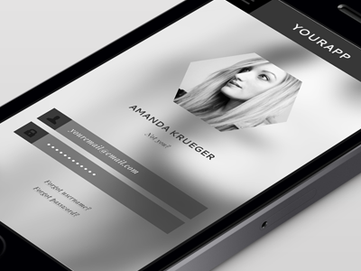
Designing in grayscale before adding color simplifies the most complex element of visual design– and forces you to focus on spacing and laying out elements.
UX designers are really into designing "mobile-first" these days. That means you think about how pages and interactions work on a phone before imagining them on your zillion-pixel $6000 pro monitor.
And that sort of constraint is great. It clarifies thinking. You start with the harder problem (usable app on a teeny-weeny screen), then adopt the solution to the easier problem (usable app on a large screen).
Well here's another similar constraint: design black and white first. Start with the harder problem of making the app beautiful and usable in every way, but without the aid of color. Add color last, and even then, only with purpose.

This is a reliable and easy way to keep apps looking "clean" and "simple". Having too many colors in too many places is a really easy way to screw up clean/simple. B&WF forces you to focus on things like spacing, sizes, and layout first. And those are the primary concerns of a clean and simple design.
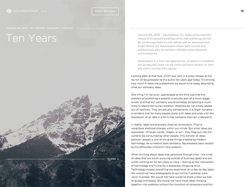
Step 2: How to add color
The simplest color to add is one color.

Adding one color to a grayscale site draws the eye simply and effectively.

You can also take it one step up. Grayscale + two colors, or grayscale + multiple colors of a single hue.
Color codes in practice — i.e. wait, what's a hue?
The web by and large talks about color as RGB hex codes. It's most useful to ignore those. RGB is not a good framework for coloring designs. Much more useful is HSB (which is synonymous with HSV, and similar to HSL).
HSB is better than RGB because it fits with the way we think about color naturally, and you can predict how changes to the HSB values will affect the color you're looking at.
If this is news to you, here's a good primer on HSB colors.


By modifying the saturation and brightness of a single hue, you can generate multiple colors— darks, lights, backgrounds, accents, eye-catchers— but it's not overwhelming on the eye.
Using multiple colors from one or two base hues is the most reliable way to accentuate and neutralize elements without making the design messy.

In my experience, adjusting your theme color to fit the use-cases your UI calls for is the most important skill in using color, and I've written a practical guide to it here.
A few other notes on color
Color is the most complicated area of visual design. And while a lot of stuff on color is obtuse and not practical for finishing the design in front of you, I've seen some really good stuff out there.
- Learn UI Design. Shameless plug: this is a course I've created, and it contains 3 hours of video about designing with color (and over 20 hours of total videos on UI design topics). Check it out at learnui.design.
- Color in UI Design: A (Practical) Framework. If you liked this section, but want to hear more about color (as opposed to just black and white), this is your article. And guess who wrote it!
- Accessible Color Generator. A handy tool for taking one color (your theme color, logo color, etc) and turning it into a whole, accessible color palette.
- Dribbble search-by-color . Another awesome way to find what works with a particular color. Talk about practical. If you already have one color decided, come look at what the world's best designers are doing/matching with that color.
Rule 3: Double your whitespace
To make UI that looks designed, add a lot of breathing room.
In Rule 2, I said that B&WF forces designers to think about spacing and layout before considering color, and how that's a good thing. Well, it's time we talk about spacing and layout.
If you've coded HTML from scratch, you're probably familiar with the way HTML is, by default, laid out on the page.
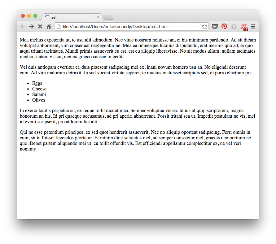
Basically, everything is smashed towards the top of the screen. The fonts are small; there's absolutely no space between lines. There's a biiit of space between paragraphs, but it isn't much. The paragraphs just stretch on to the end of the page, whether that's 100 px or 10,000 px.
Aesthetically speaking, that's awful. If you want to make UI that looks designed, you need to add in a lot of breathing room.
Sometimes a ridiculous amount.
Here's an illustrative music player concept by Piotr Kwiatkowski.
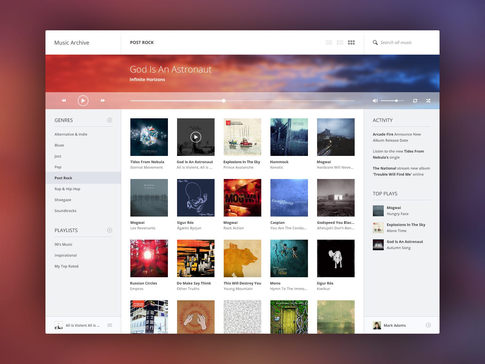
Pay particular attention to the menu on the left.
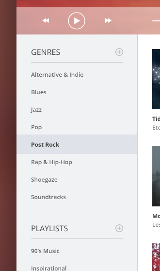
The vertical space between the menu items is fully twice the height of the text itself. You're looking at 12px font with just as much padding above and below it.
Or take a look at the list titles. There's a 15px space between the word "PLAYLISTS" and its own underline. That's more than the cap height of the font itself! And that's to say nothing of the 25 pixels between the lists.
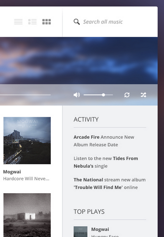
The left sidebar shows generous spacing in between lines of text, and more.
Piotr was conscientious about putting in extra space here, and it paid off. While this is just a concept he put together for the fun of it (as far as I know), as far as aesthetics go, it's beautiful enough to compete with the best music UIs out there.
Good, generous whitespace can make some of the messiest interfaces look inviting and simple.
Put space between your lines.
Put space between your elements.
Put space between your groups of elements.
Analyze what works.
OK, that wraps up Part 1. Thanks for sticking around!
In Part 2, I'll be talking about the last 4 rules:
4. Learn the methods of overlaying text on images
5. Make text pop— and un-pop
6. Only use good fonts
7. Steal like an artist
If you learned something useful in Part 1, read Part 2.
Still can't get enough? Introducing… Learn UI Design
I've been plugging away to create the single most comprehensive online video course for learning the practical skills of interface design.

Learn UI Design covers all kinds of topics:
- Color. Picking good colors, adjusting them for different purposes in your interface, developing a palette, fixing clashing colors, and more.
- Typography. Choosing fonts, styling text, pairing fonts, and more.
- Fundamentals of design. Spacing, alignment, grids, layout, lighting, shadows, and more.
- User interface elements. Form controls (like buttons and text boxes), icons, imagery (like photography and illustrations), tables and lists (hugely important for mobile app design), and more.
Here's an idea of how much content there is. The topics you've already heard about — lighting, use of gray, and spacing — each have their own videos, totaling 1 hr, 52 min.
There is a ton of content in this course: 20+ hours of video in 40+ video lessons.

In almost every video, you'll watch me design in Sketch. This is important. I'm not teaching some theoretical framework here. Instead, everything I show you is the tips, tricks, and frameworks I use to design interfaces every day. Think of it as watching over my shoulder as I teach you everything I know.
For example, in the "Gray" video (yes: 27 minutes all about using a single color), I start by showing you a practical technique to make your grays match your theme colors, no matter what those colors are. Then I do another demo to show off gray's versatility, explaining ways in which its subtlety is actually a strength. This includes some tips that took me years to notice.

Finally, I explain why gray is the classiest color, and used by so many luxury and fashion brands. Then I explain the homework for the lesson and wrap up. By the end, we've done 3 live demos, explained a few key tricks for how to add gray to your designs, and looked at 10 well-designed real-world examples (including 1 designed by me).
Here's what folks are saying about Learn UI Design:
"Learn UI Design is like learning how to fly a plane by actually sitting in the cockpit with the pilot — Erik is constantly designing/redesigning real-world examples right in front of you, explaining why X is good or bad, and how to go about making it even better."
— Mudassir Ali, Frontend Engineer, Canva"Learn UI Design's straightforward approach, illustrated with real-life examples and tutorials, was extremely helpful and eye-opening. I would highly recommend this course for UX designers wanting to add UI design to their toolkit."
— Sarah Kim, UX Design Lead"Erik's pragmatic approach to design has taught me infinitely more than what reading any design books ever did! Away with the books, and one more video please."
— Anders Nysom, Freelance Developer
If you're a dev, UX designer, or PM, and want to add visual design to your skillset, this course is tailor-made for you. Hop on over to learnui.design for more.

Oh, and finally: I have a Design Newsletter to which I intentionally send out very few but very high-value design articles (like the one above). If you want to see stuff like this every month (or 6) in your inbox (basically all of it unpublished anywhere else), you should take a moment and sign up:
How To Create An Elegant App Design
Source: https://medium.com/@erikdkennedy/7-rules-for-creating-gorgeous-ui-part-1-559d4e805cda
Posted by: rimmerflon1980.blogspot.com

0 Response to "How To Create An Elegant App Design"
Post a Comment